Like many automotive photographers, I got my start in taking photos by simply being a car enthusiast, and as a car enthusiast, it was natural for me to take part in various Internet-based forums. One of the main forums I was and continue to be involved in is the North American Subaru Impreza Owners Club, or “NASIOC.” It was from this forum that these tips and tricks to automotive photography originated, and the thread is still going very strong today. Below is the latest revision of my tips and tricks, which actually represents the main purpose of No ƒ8 But What We Make: to provide a solid, no-nonsense guide to learning and improving photography on the whole.
I started shooting cars professionally as part of Subiesport Magazine since the magazine’s inception back in 2004. I learned a lot along the way, since at the time I was really a complete newbie when it came to photography. Consequently, I must thank my good friend Josh Mackey (http://www.mackeydesigns.com) and Subiesport Publisher Ryan Douthit for their help and tutelage. Ferg, a NASIOC Super Moderator, asked me to write something up, so I am honored to pass on some of my basic automotive photography methods to NASIOC and now No ƒ8 But What We Make, and I hope that these can help both beginners and experienced photographers alike. By no means do I regard myself as all knowing in automotive photography, but I love to help people take better pictures and learn new techniques right along side me. Without further ado, we’ll first start out with basic composition.
Part 1 — Point and do WHAT?
Just because you don’t have the latest and greatest neck-breaking digital SLR doesn’t mean you can’t take good pictures. Even a camera phone can take good pictures, even if they’re not the clearest in the world. First and foremost, composition makes or breaks a picture, and shows the difference between a snapshot and a photo. Some things may seem rather basic, but even I myself forget certain things from time to time.
Centered is rarely best
It’s easy to take a picture and put everything you want in the center, but unfortunately it doesn’t make for good photography. Generally, you want to follow the Rule of Thirds, which basically means that you want to put your subject at the cross section of two lines that cut your photo into thirds. An easy way visualize this is to imagine a tic-tac-toe board on your screen or viewfinder. Some cameras may even have this as an option to overlay on the screen. Here is an example of the Rule of Thirds in action:
I’ve overlaid the “Rule of Thirds” grid from Photoshop’s crop function so that you can see the grid lines. You can see how the car is situated right at what I call a “thirds crosspoint” to follow the Rule of Thirds. Keep in mind, while this is called a “rule,” it’s actually more of a guideline. I definitely recommend that you practice the Rule of Thirds so that you find yourself always doing it, and then you can get more creative with breaking the rule. This is one of the most important things to learn in photo composition, so definitely make sure you master it before feeling like you can break it any time.
Angles can be good…and bad
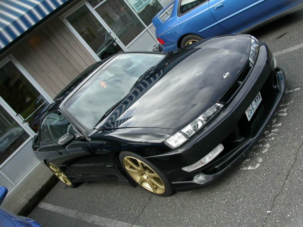
Going overboard on crazy angles to get a unique picture is very easy to do, but that doesn’t mean it’s the right thing to do. Remember that you want the viewer of your photo to truly grasp what you’re trying to capture, but if they have to break their neck or do a headstand to see it, then they’ll probably just look elsewhere. Make no mistake, there’s a time and place for crazy angles, but use them sparingly and make sure that everyone can tell what they’re looking at. Here is a very bad example from when I first started taking photos:
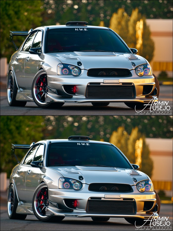
Also, keep in mind that a very slight angle can change the feel of a photo. Here is the same car, just with a slightly different angle to the photo. Which do you prefer? It all depends on what your purpose is:
Avoid the cut-off
Just a quick and simple tip. If you’re trying to take a picture of the whole car, make sure you actually take a full picture of the car, and don’t cut off the bumpers, wheels, spoilers, etc. It makes sense to cut off sections if you just want to single one or two things out (such as close-ups of individual parts in an engine bay), but if you want to get everything, pay attention not to cut off parts of your subject.
Wheels vs. Tire Tread
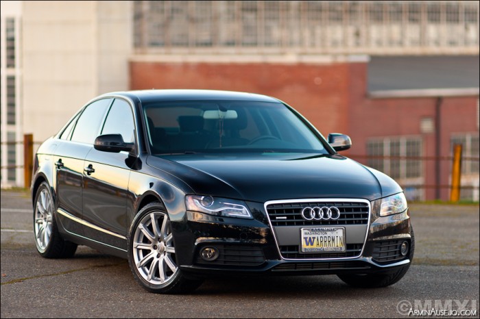
In this grudge match, the wheel always wins. If you’re taking a picture of a car, especially from ¾ position, angle the wheels so that the face of the wheel is facing the camera, not the tire tread. While some tire tread is really aggressive-looking, 99% of the time the photo will be better showing off the face of the wheel instead of the tire tread, especially if they’re aftermarket wheels. Even stock wheels can look good in a properly taken photo, but we won’t know that unless we actually see them, right? There will be times when you just want the wheels to be straight, but turning the wheels to face the camera often gives a more posed look that shows that you’ve taken your time and put effort into the photo, rather than just taking a photo of a car off the street. Here is an example using a 100% stock car:
The background is not just noise
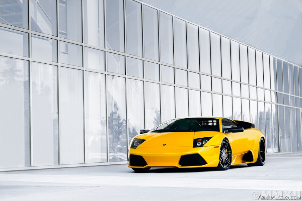
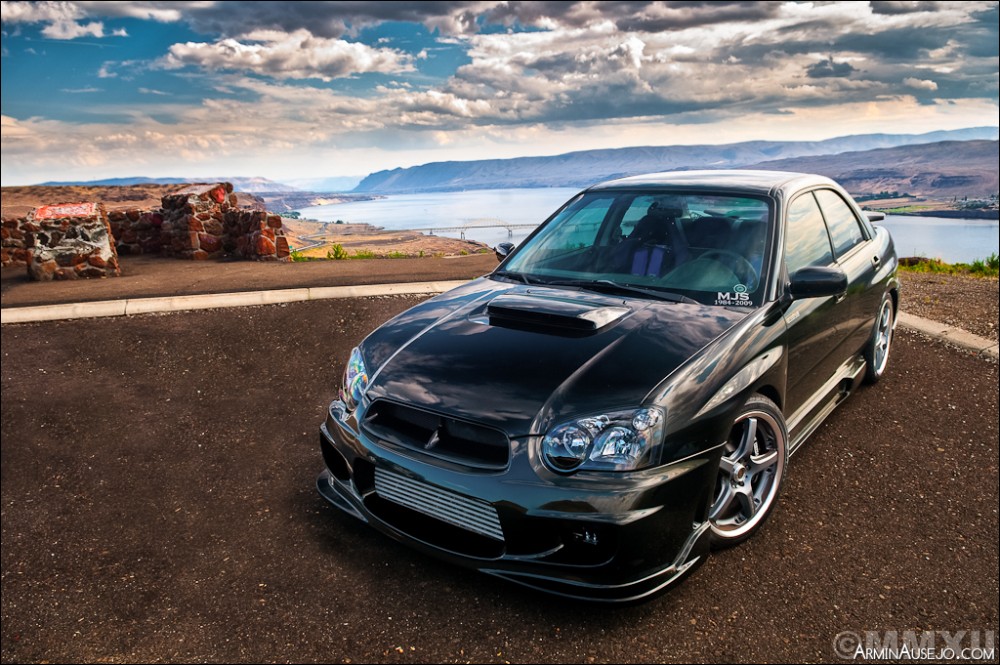
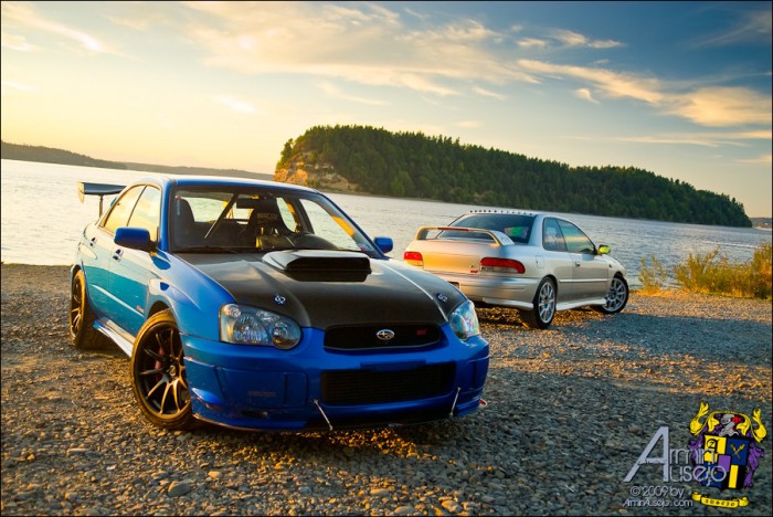
While the car is going to be the subject of your photo, that doesn’t mean that the background doesn’t matter. Even with proper composition, a good background can substantially help or wreck a photo. Industrial backgrounds are very overused, but it’s understandable to use if you’re in a pinch. Ideally, you want a background that helps add to the theme of a photo or just plain looks good overall. A driveway photo shoot isn’t all that great either unless the driveway is filled with a bunch more nice cars. Just be careful not to choose a background that blends in too much with your car, because then your subject won’t stand out. Here are a couple of my favorite backgrounds that I’ve been able to use:
It is also very important to make sure there aren’t distractions in the background that interfere with your subject, such as trees or poles growing out of the car, power lines dominating the scene, or random garbage on the surrounding ground. Attention to detail is very important when it comes to your background, and can easily be the difference between a simple snapshot and an actual thought-out photo.
Camera elevation
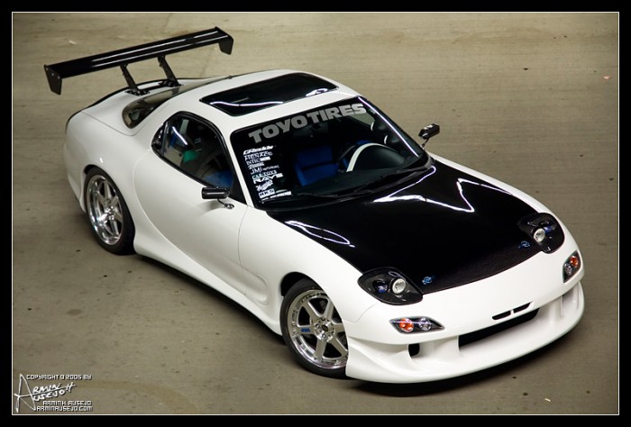
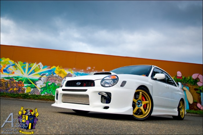
A key point of any type of photography is to try to capture something that isn’t normally seen by your naked eye. Thus, try your best not to take photos from standard standing height. If you get real low or get real high, you’ll have a much better overall photo. Very rarely will you see me taking a photo from a standing position. I sometimes even bring a stepladder with me to get a higher elevated shot, since being Filipino, I’m not a tall man. And, don’t be afraid to get dirty with a low shot. Here’s a high and a low example:
That just about wraps it up for basic composition. In Part 2, we will go into properly capturing light.


One comment